ARTPALACE /
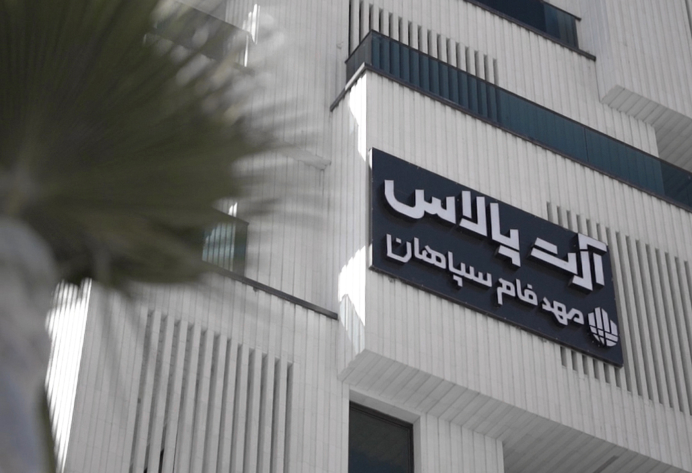
“ Art Palace “ a luxurious project by the large Mahdfam Sepahan Holding, stands as a prominent example of modernity and elegance in the construction industry. Our studio is responsible for designing the visual identity of these buildings in a way that aligns with their unique character and features, fully reflecting their luxury and modernity.
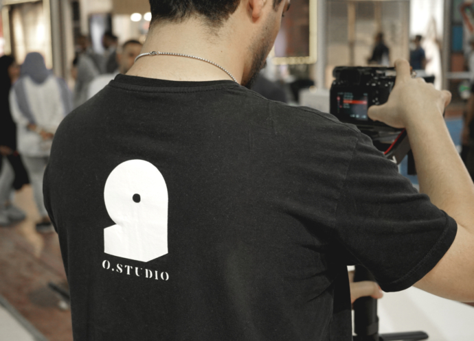
Credit/ Ostudio
CREATIVE DIRECTION, DESIGN/ Parisa Favaedi
DESIGN/ Mahtab Mazaheri, Farnaz Kiumarsi,

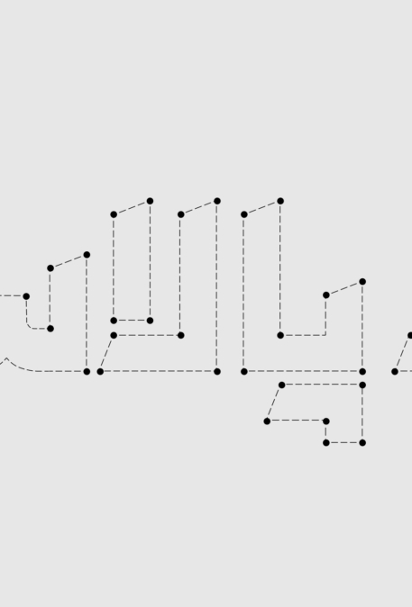
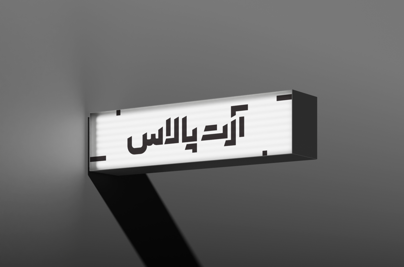
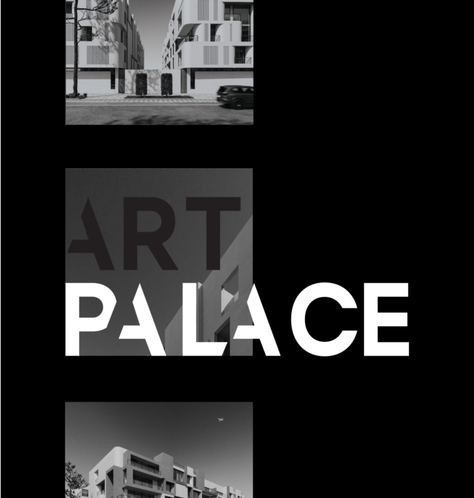
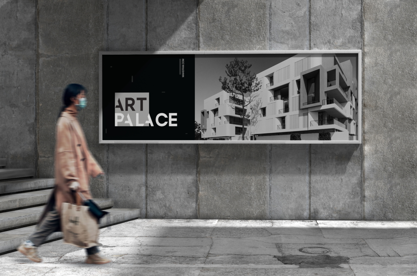
The Persian logotype for “Art Palace” employs a bold and geometric typographic approach, characterized by strong angular forms that emphasize structural integrity and precision. This design leans heavily on minimalism, where the reduction of visual elements enhances clarity and modernity. The interplay of positive and negative space is carefully orchestrated to create balance and ensure optimal legibility while maintaining a sophisticated aesthetic.
The typeface choice is distinctly architectural, with sharp edges and well-defined proportions that echo the brand’s association with high-end construction and modern luxury. The uniformity in stroke weight across the characters provides a cohesive visual rhythm, while subtle spacing adjustments (kerning) further refine the overall balance. This minimalist design language, devoid of unnecessary embellishments, underscores the brand’s contemporary ethos and commitment to quality and elegance in every detail.
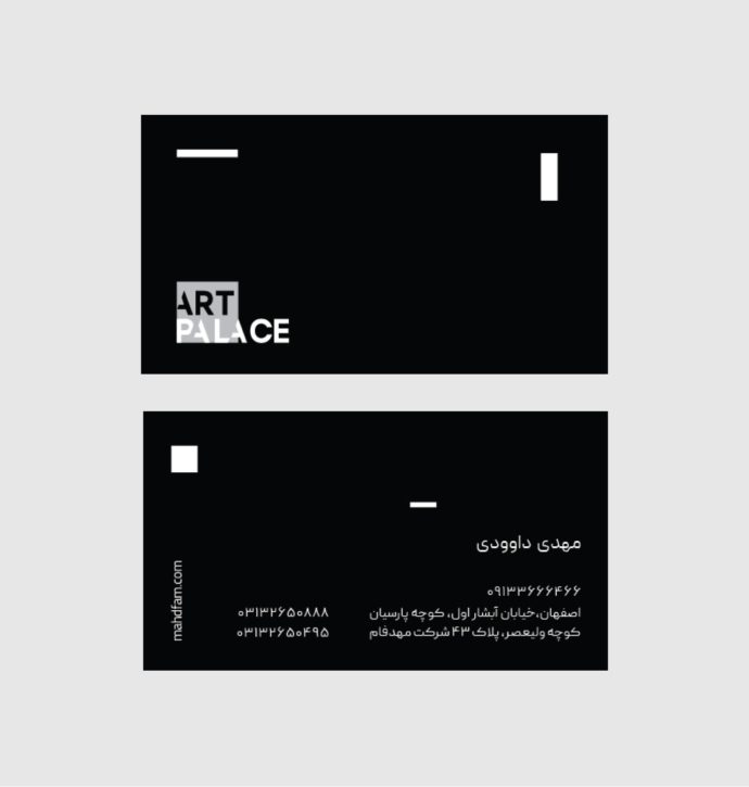
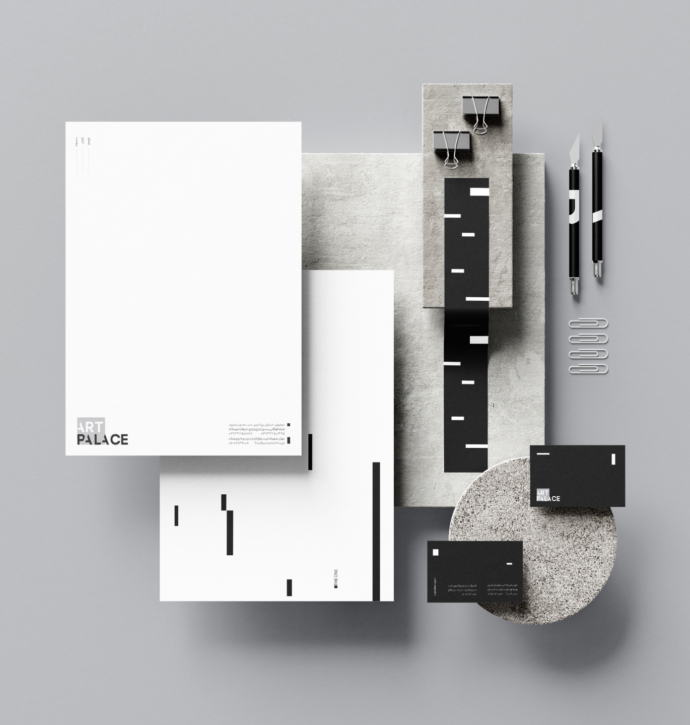
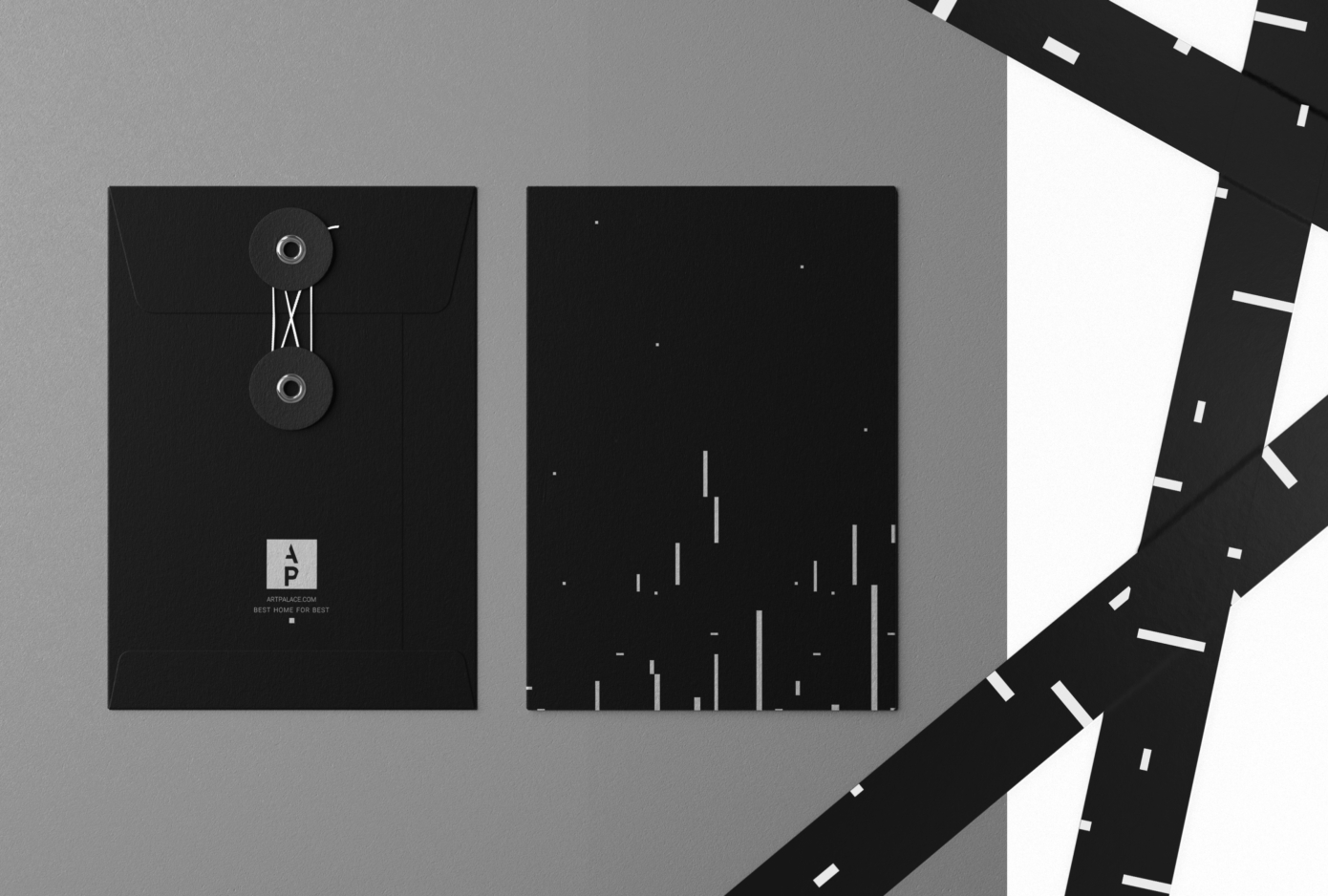
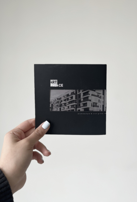
The visual identity of “Art Palace” focuses on minimalism and simplicity, using black and white to convey a luxurious and modern feel. The typographic design and graphic elements, with their rectangular forms and clean lines, evoke a sense of order and strength. The use of negative space and simple shapes enhances readability and modernity, clearly communicating the brand’s message. This visual identity reflects a blend of art and modern architecture, showcasing the brand’s quality and innovation to its audience.
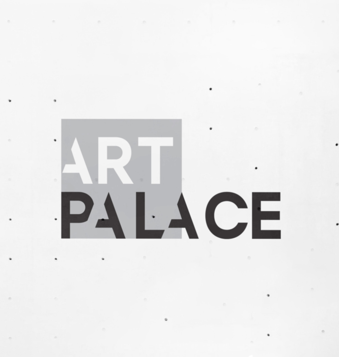
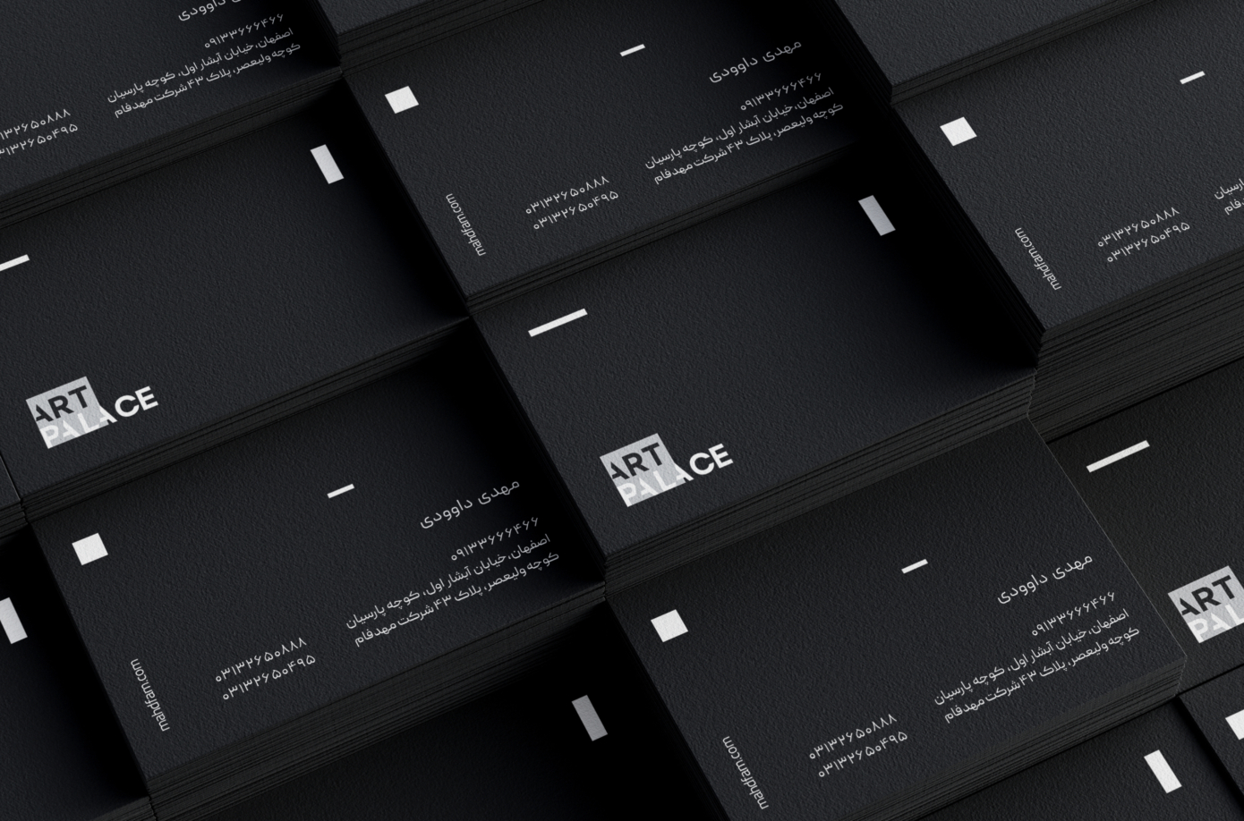
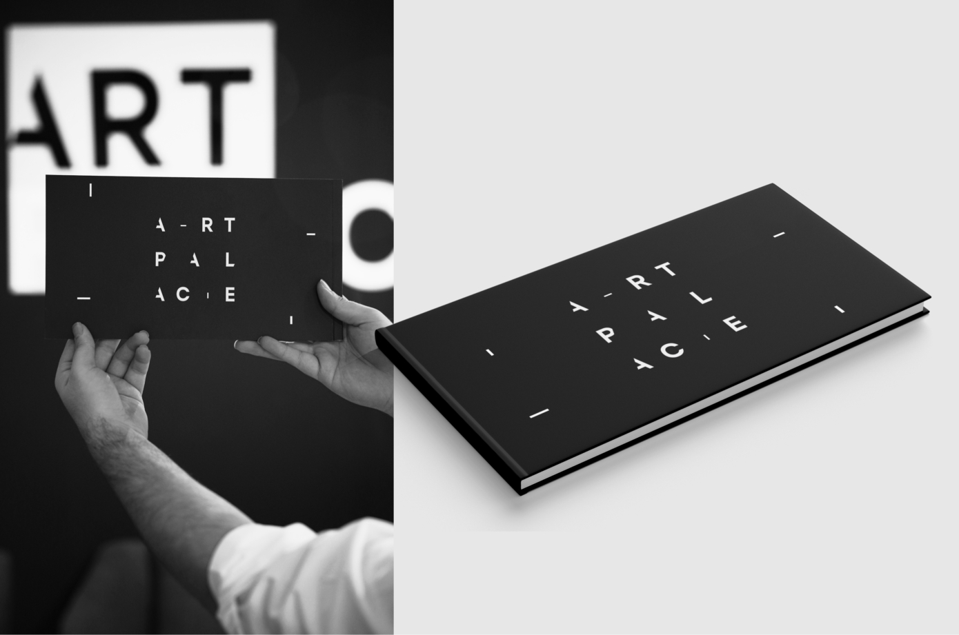
The “Art Palace” logotype features a bold and minimal design with smart use of negative space. The “ART” section is placed within a gray square with white letters, emphasizing the artistic aspect of the brand, while “PALACE” is designed in black, free of a box, creating a balanced and visually appealing contrast. The clean, geometric lines and sans-serif typeface convey a sense of order, modernity, and luxury. Overall, the logo creates a memorable and sleek visual identity, perfectly aligned with the brand’s focus on art and architecture.
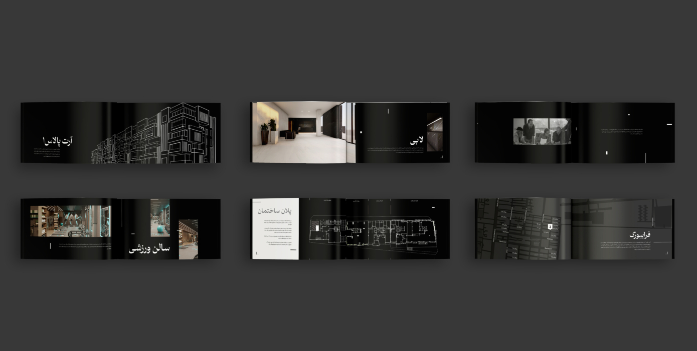
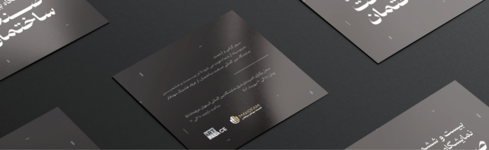
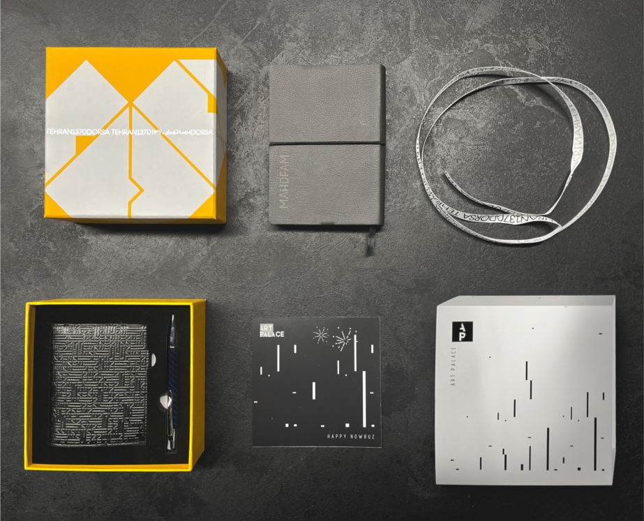
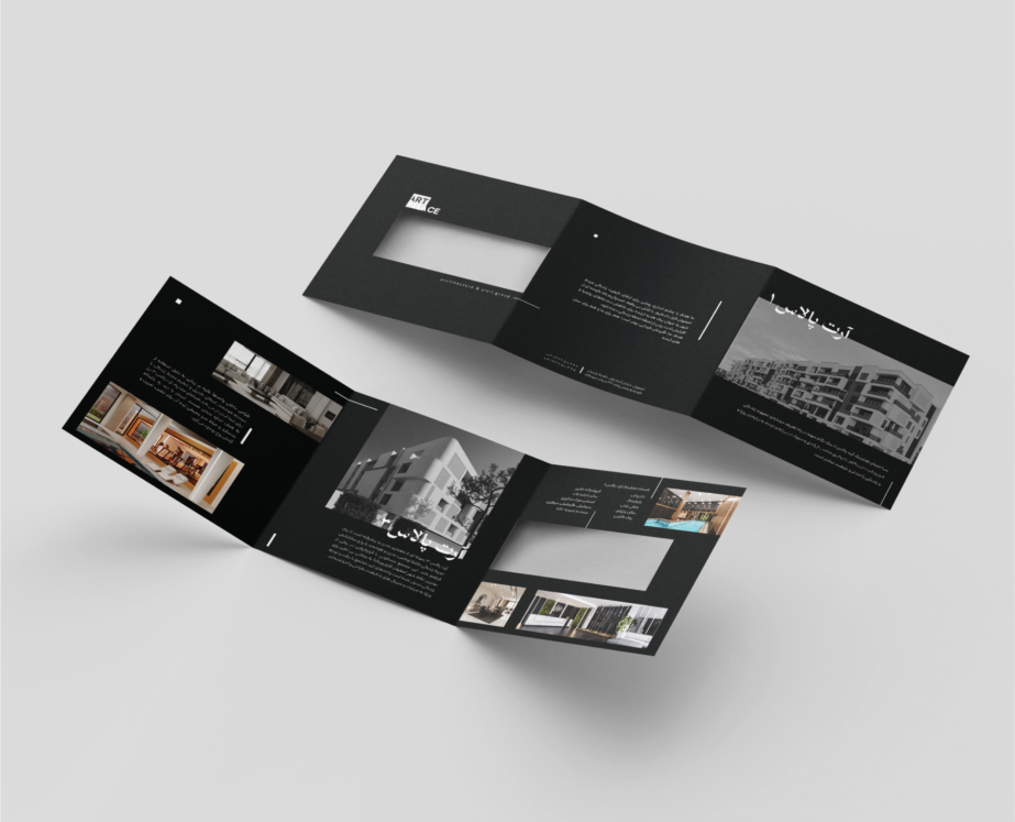
The brochure for “Art Palace” buildings is designed with a modern and minimalistic approach, offering a cohesive and visually appealing experience. The use of black and white, along with negative space, gives the brochure a luxurious and minimalist feel that aligns perfectly with the brand’s identity. High-quality images of the buildings’ interiors and exteriors captivate the audience and effectively showcase the precise architectural and interior design details. The combination of these images with clean, organized layouts and simple graphic elements creates a smooth visual flow, allowing the audience to easily access the information. The clean and legible typography enhances readability and reinforces the brand’s modern and professional identity. Detailed architectural plans included in the brochure highlight the technical precision and high-quality standards of the projects, building trust with the audience. Overall, the design of this brochure aims to present a strong, unified image that effectively communicates the value and premium quality of “Art Palace” projects.
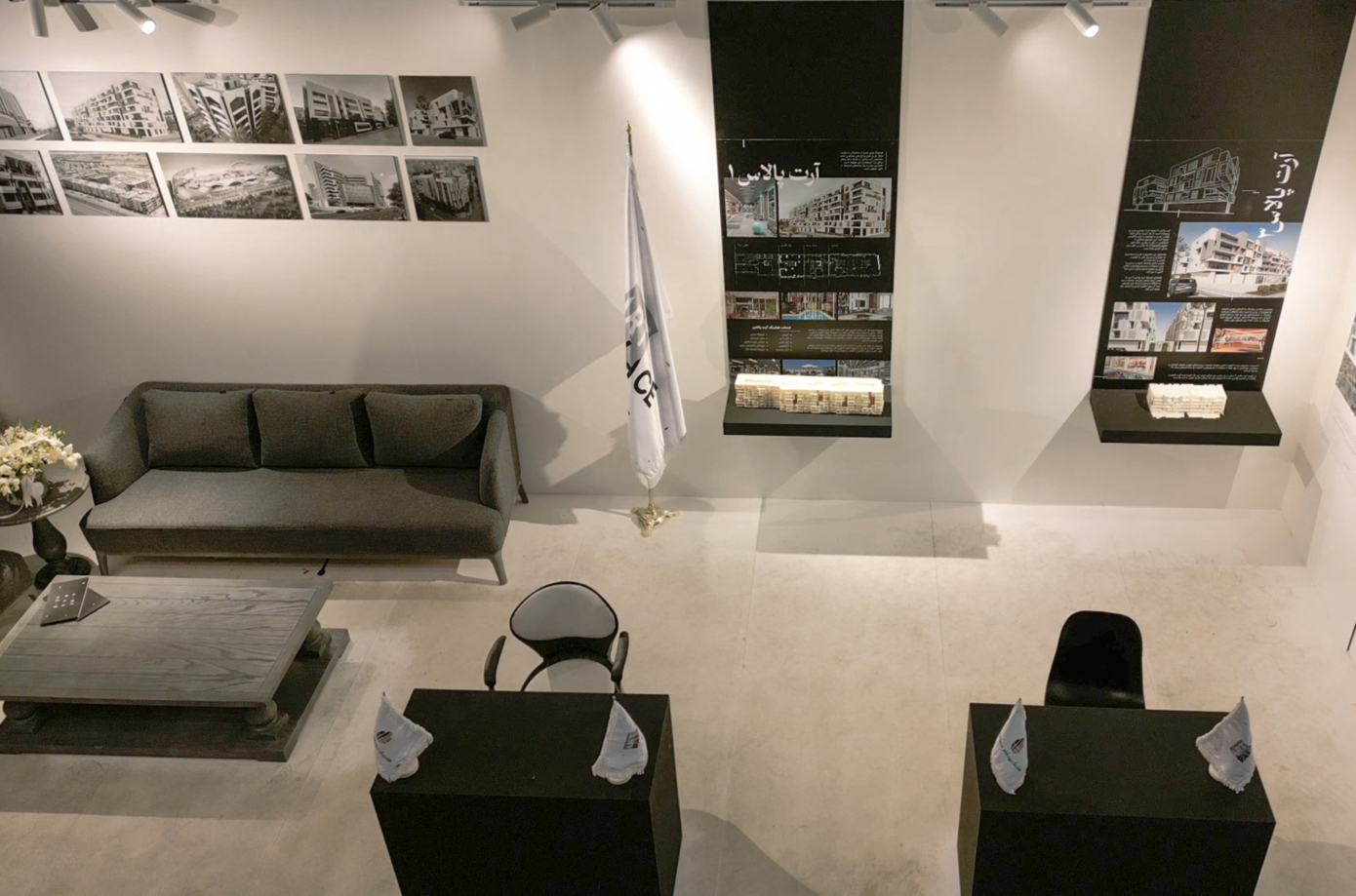
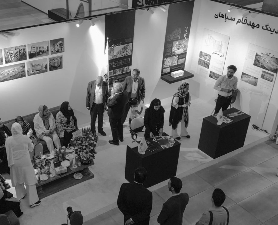
The architectural photos and models are prominently displayed on the walls, helping to highlight the projects and drawing the visitors’ attention to the intricate details. Additionally, the placement of the brand’s flag next to small desks designed for visitor interaction reinforces the brand’s visual identity.
Overall, the design of the booth, with its blend of simple and elegant elements, creates an environment that focuses on showcasing “Art Palace” luxury projects while also attracting visitors in a professional and welcoming setting.